jmunoz-cgs17
Friday, May 5, 2017
Wednesday, May 3, 2017
Week 15 - Movie Post
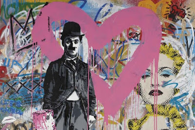
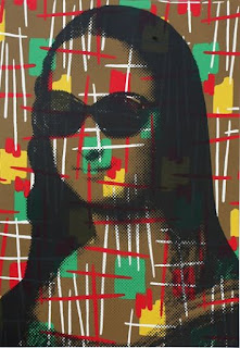
Mr. Brainwash: Mr. Brainwash is a French born street artist who is based in Los Angles, California. His real name is Thierry Guetta. Guetta entered the street artist world when he began following other famous street artists and filming everything they did. A few years after getting into the street art world he decided to create his own art. His style was basically taking an already existing piece of art and "making it better" by adding something to it. This is why many other established street artists are not content with him. He basically decided he would start creating art one day and many like Banksy do not think that is how it works.

Special Edition Blog (Final)
Masterpiece
Still Life with a Basket of Fruit and a Bunch of Asparagus; Louise Moillon
This piece was by far one of my favorite pieces in the museum, which is why I chose it as a masterpiece. I caught my attention as soon as it was pointed out. It was as if I was looking at a real bowl of fruit and vegetables . Probably what pops out the more are the cherries. I have always found it amazing how early painters were able to use the different colors of paint to add some shadow and some lights to their paintings to make them look so realistic. Now I can do that on Illustrator or another computer program, but it is difficult to think about how they did it with actual paint. My eyes first locked in on the cherries, but as I got closer everything else also looked realistic. Of course once I was standing right next to it you could see it was just paint on a canvas. I felt that the shades complemented really well with the fruit. By this I mean how the back it all black as it gets to the table it gets lighter. It makes it look like the table is actually close when realistically everything is the same distance away. This painting looks like a bowl of fruit more than an acutall bowl of fruit looks. It is difficult for me to explain because I do not have the most knowledge in art, but these types of paintings are something I have always found fascinating.
Disasterpiece
This was by far one of the worst works of "art" that I saw at the Institute. I guess you can say it is indeed abstract. Not knowing a lot about art I get aggravated thinking that this was so simple and it is hung in an art museum, but I get aggravated because I didn't think about doing this myself. I must say I am a big fan of adding black borders to most of my work especially when working with white also. For this reason it did catch my attention. There is a really nice contrast going on between the border and the middle, so that definitely works, but other than that there is really nothing else going on. Sure it can catch your attention as a whole, so it does have that working for it. This piece of art needs some more content because after catching the attention of the viewer for a couple of seconds, there is really nothing else that can capture the viewer's eye.
Week 14 - Box Design
Craft: To create this box design I first downloaded the template from makeplayingcards.com. To create the illustrations that I used I simply used the pen tool, and the ellipse tool.
Composition and Concept: Aside from the players I created all the illustrations from scratch. To create the grass I made a long triangle with a gradient that contained different shades of green. I did it this way because I found that if I used the same shade of green then it wouldn't even resemble grass. I then duplicated it until I had enough to cover the entire grass area. For the ball I traced a picture of a soccer ball. For the net I created the post with the pen tool, but the hard part was creating the net. I ended up using the rectangle tool for that. I just had to make really thin rectangles and place them so that the resemble an actual net. For the soccer balls I used the same one that I already had and just duplicated it. I used guides to make sure they were placed in a straight line. I was surprised with the lights because when I was working on them in Illustrator I could not see the shadow so I just stopped and was going to place them in InDesign. When I did you could actually see the shadow, and I was glad because that was what I was trying to achieve. For the Goal! signs I created the shapes out of scratch. I used guides to make sure they were symmetrical. I added a gold border to the shapes just small enough to make it stand out. I made the background black because the concept for this box was to keep it simple and cool, and I think I achieved it.
Week 13 - Second Half Deck Of Cards
Craft: To create the second half of the deck I used the same process that I used for the first half of the deck that I posted for week 12. To create these cards I began using InDesign. I used the master pages, guides, rulers, ellipse tool, the rectangle tool, the line segment tool, and the place tool.
Composition and Concept:
To create these cards I first created them all for the A master. After that I duplicated them 3 times and I based the 3 duplicates off the other 3 masters. I did like this because while I was playing around with InDesign I found that if I did it this way I could simply place the player with a different color and it would be placed in the exact same location. The only difference with the second half of the deck was the black cards. I did not create a Master for these cards, instead I just changed the color of the rectangle to black. To have all the 108 cards I just used the Duplicate tool to create all the cards that were needed.
Week 12 - First Half of Card Deck
Craft: To create these cards I began using InDesign. I used the master pages, guides, rulers, ellipse tool, the rectangle tool, the line segment tool, and the place tool.
Composition and Concept: The first step I took to create these cards, was to build an master page. I built the A Master page by first creating a rectangle of the side of the card and filled it out with a blue color. After that I placed a square layout that you can kind of see in the background. This square layout I created in Illustrator, and I wanted to use this on my cards to add a bit more of detail to them. I wanted them to look appealing to the user. After this I set up guides in the middle of the card so that I could create a perfect circle and have it placed exactly in the middle. this circle would be where I would place all the soccer players. Using the same guides I placed one player on the card because I wanted to make sure the players would also be exactly in the middle. I then set up guides in order to create the circles in the corners, and so that they would be placed exactly at the same spot in the different corners. To create the white outline shapes I setup guides so that they would be equally as far from the border all the way around. I simply created the shape by using the pen tool. After all this I created three other masters based off of Master A. I used the control+shift+click to the select the rectangle in each master to change the color. Finally I placed all the different players on the different cards.
Subscribe to:
Comments (Atom)


